How an NJ Primary Care Practice Got 85% New Patients Online in 12 Months
Mullica Hill Medical & Wellness was facing challenges with their redundant PDF patient forms on an outdated website. Practifly redesigned the practice’s logo, optimized the site design, and set up effortless digital patient forms to streamline appointment-scheduling. The result? More website traffic, more local patients.
Download the Case Study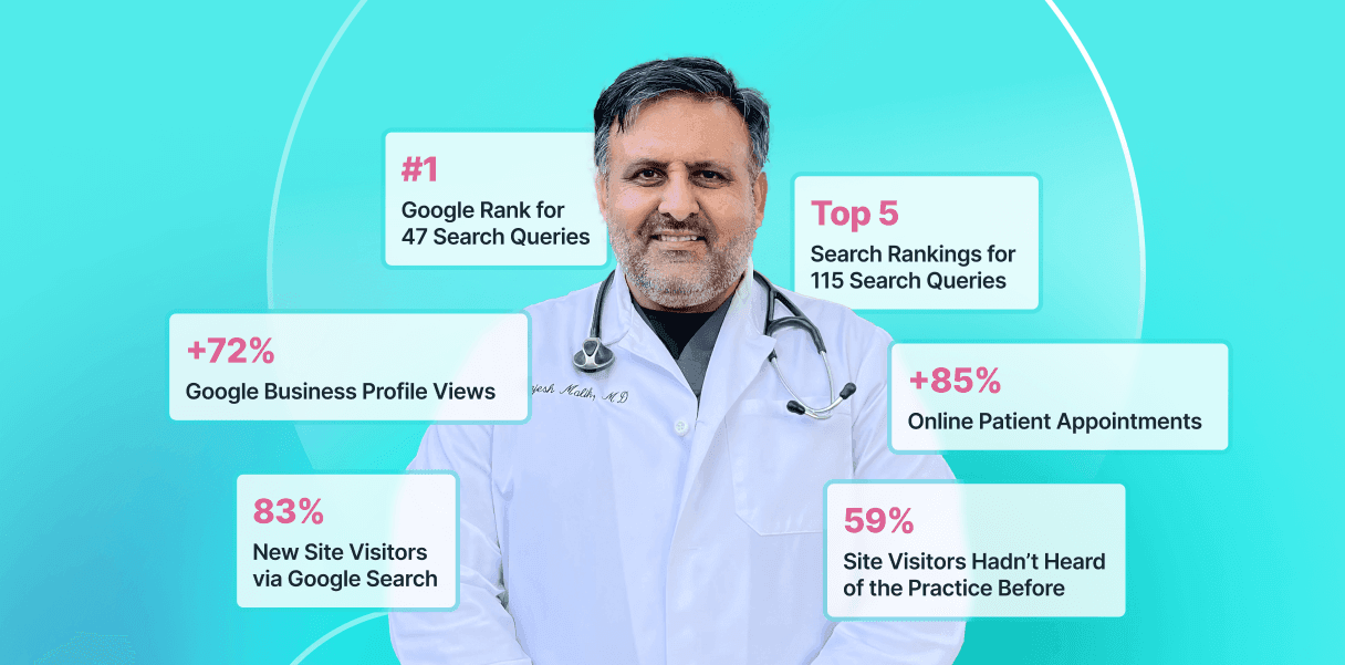
Providing Comprehensive Primary Care & Weight Loss Treatment Services
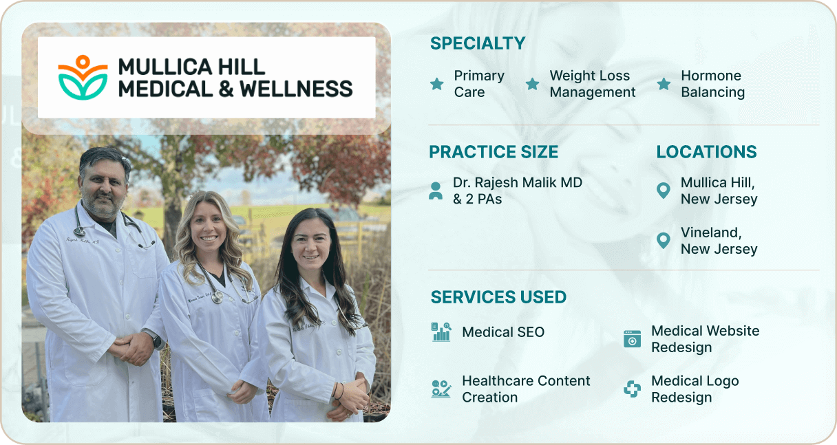
Mullica Hill Medical & Wellness is a primary care practice with an on-site lab in Mullica Hill and Vineland, New Jersey. It offers a full range of medical services, from weight loss management and family care to hormone-balancing therapies. Led by the highly-experienced Dr. Rajesh Malik MD, it also has a dedicated team of 2 physician assistants.
The Challenge: An Outdated Website with Inconvenient PDF Patient Intake Forms
Before teaming up with Practifly, Mullica Hill Medical’s website used to be managed by another agency. But the website was outdated and tough to navigate, missing many features patients expect today.
The patient intake process was particularly cumbersome. Patients had to print out, fill in, and hand in PDF forms manually to the front desk. This not only frustrated patients, but also created extra work for the front desk staff, who had to enter all the data by hand. The appointment-scheduling process thus became tedious and time-consuming.
Dr. Malik knew it was time to revamp the website for a better patient experience and a smoother intake process. After meeting with Practifly’s product head, Swapnil, he saw the value in our CMS and design services and decided to go ahead.
“Partnering with Practifly has been amazing! We're thrilled with how much our online presence has improved.”
–Dr. Rajesh Malik MD, Owner of Mullica Hill Medical & Wellness
The Practifly Strategy: Redesigning the Website, This Time with Patients in Mind
Practifly tackled the challenge with a patient-first mindset, focusing on designing a standout website in the competitive healthcare market. The goal was to simplify website interactions for patients and enhance their overall experience.
1. Comprehensive Website Audit
Our first step was a thorough audit of the existing website. The audit revealed several critical issues:
- No Clear Call-to-Action (CTA): The website lacked prominent CTA buttons, such as ‘Schedule Appointment’ or ‘Contact Us,’ which are crucial for converting website visitors into patients.
- Cluttered Homepage: The homepage was disorganized, featuring only one doctor without providing links for further information. Services were scattered across the page, making it difficult for patients to find what they needed.
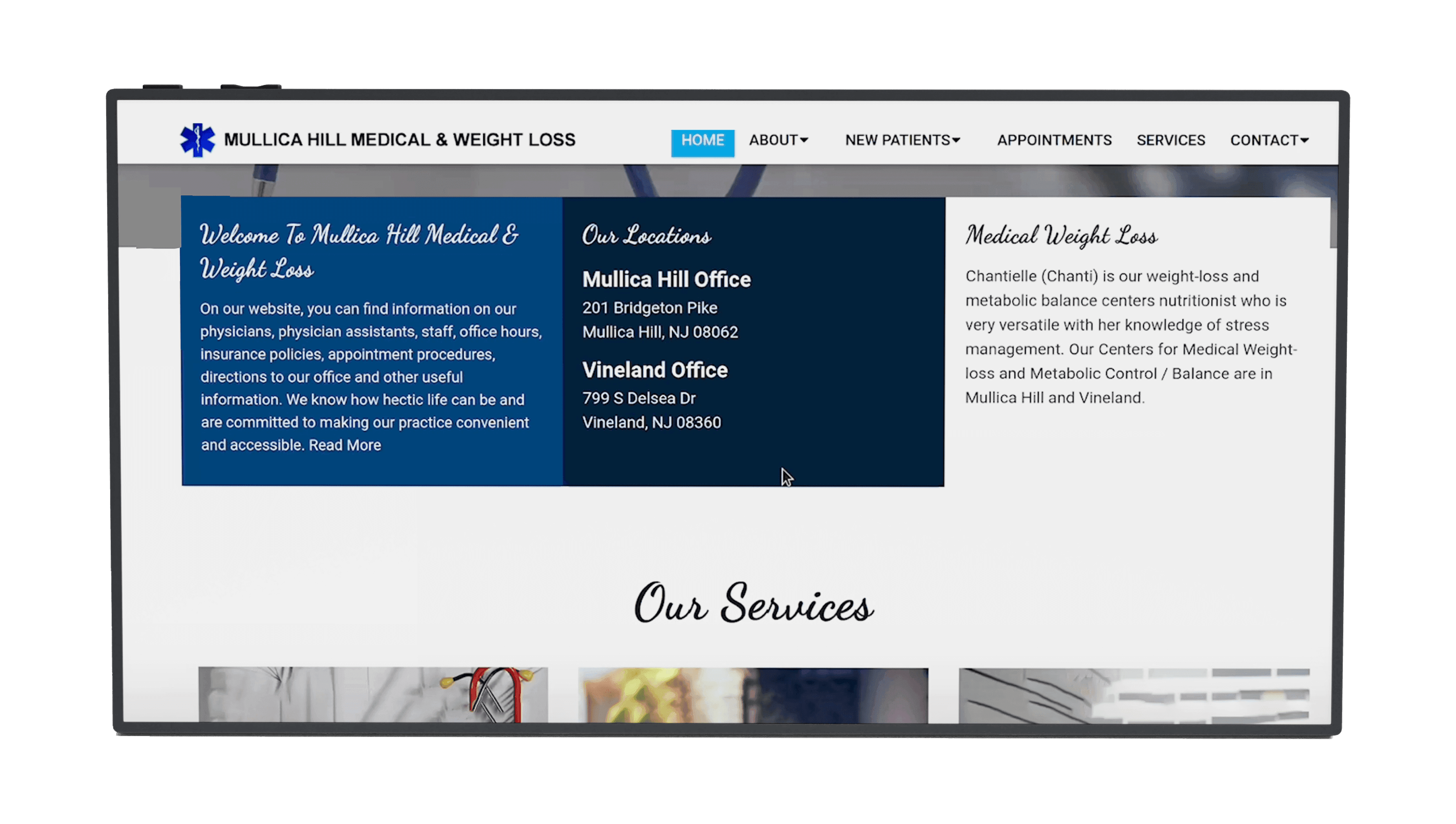
- Lack of Internal Links: Service cards on the website did not link to specific service pages, leading to a frustrating user experience.
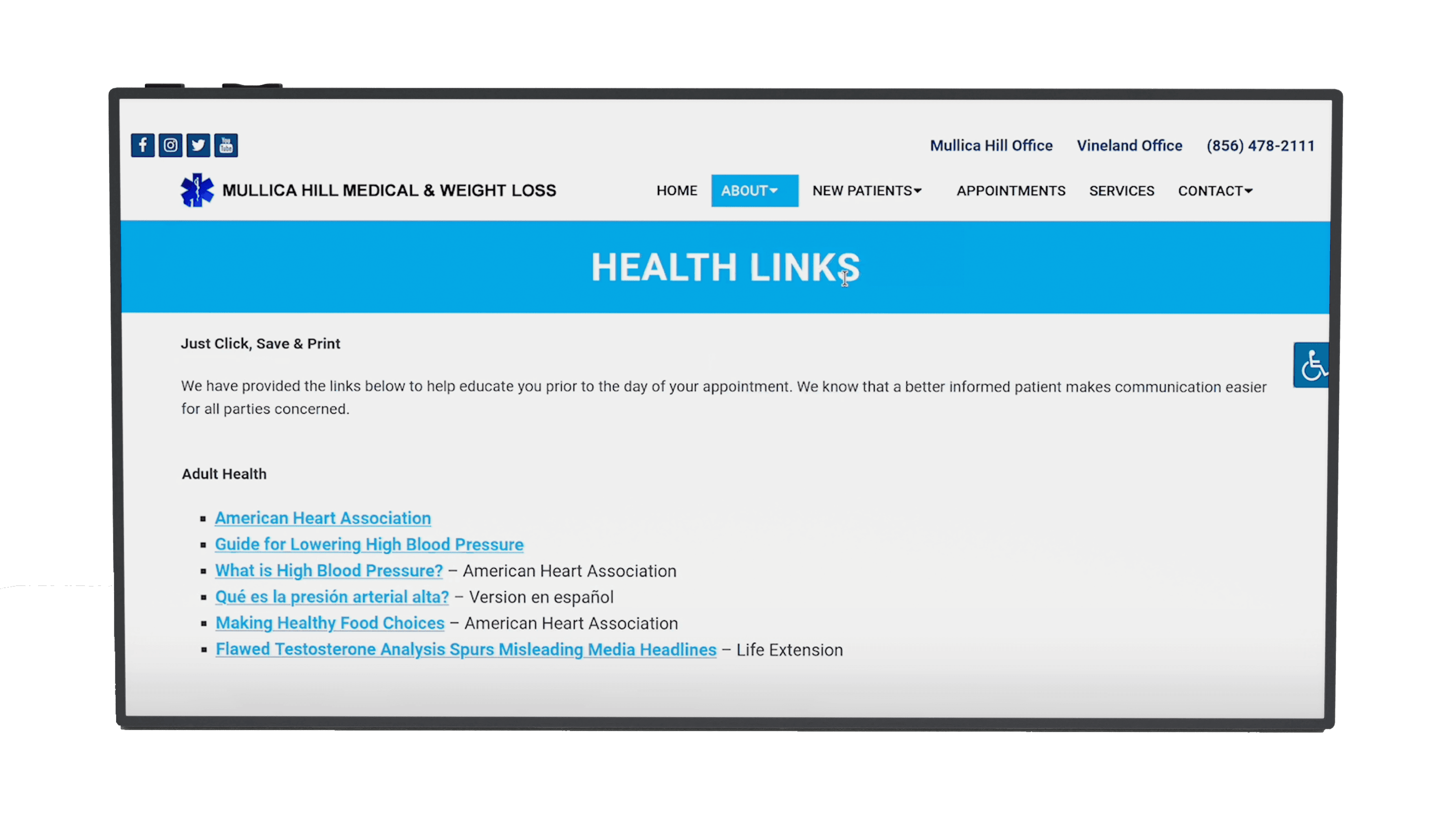
- Missing Footer Elements: The footer was incomplete, missing essential components like the practice logo, operating hours, a map for directions, social media icons, and contact information.
- Broken Links and Security Issues: The website contained numerous broken links and HTTP pages instead of HTTP(S), negatively impacting search engine rankings and patient trust.
- Redundant Patient Forms: The ‘Contact Us’ page featured 2 PDF forms with overlapping fields, confusing patients and adding unnecessary steps to the appointment-scheduling process.
2. Redesigning the Website with a Patient-First Approach
New Logo, New Brand Identity
Mullica Hill Medical’s previous logo was pretty generic and lacked a consistent color scheme. So, we created a unique, professional logo in teal and orange. This new logo better connected with their patients.
Keyword Research and SEO
We targeted local search queries and specialty-focused services to find the most relevant terms people used to find the practice. This helped ensure that their website would pop up in Google searches.
A New Content Structure
Next, we created SEO-optimized content tailored to the practice’s specialties, making it easier for patients to find the required information. We then smoothly integrated this content into Practifly’s proprietary healthcare CMS.
Balancing Design and Functionality
Designing the new website wasn’t just about making the website look good; it had to be properly functional, too. So, we designed a sleek, modern website with a clean navigation structure.
“The Practifly team incorporated all of our feedback in the design and content creation process.”
– Dr. Rajesh Malik MD
Accessibility and Mobile-Friendliness
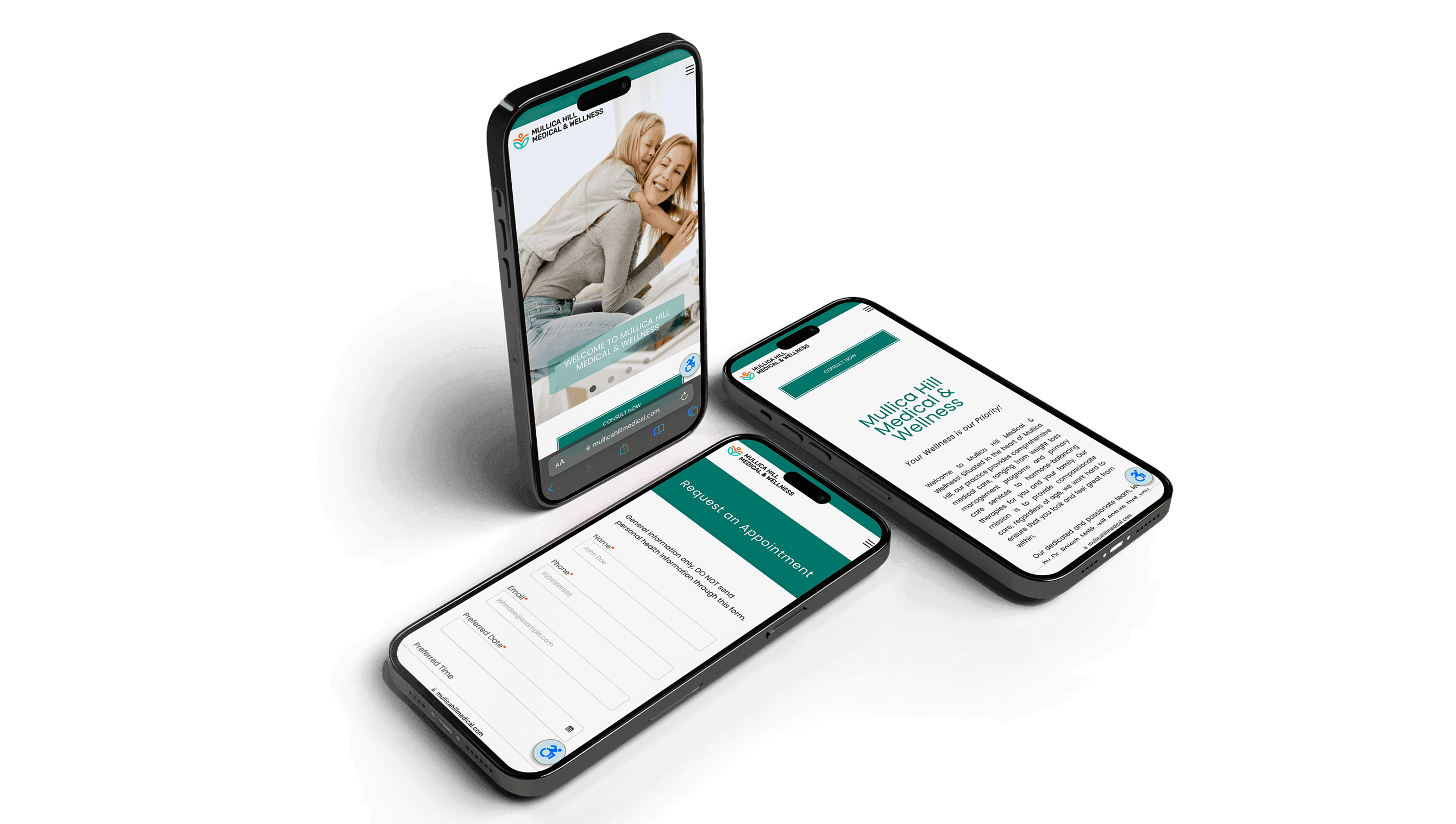
We added an accessibility widget to meet Web Content Accessibility Guidelines (WCAG) and American Disability Act (ADA) standards, making the website usable for everyone. Then, we optimized the website for readability and easy navigation on mobile devices.
3. Creating Online Forms for a Smoother Patient Experience
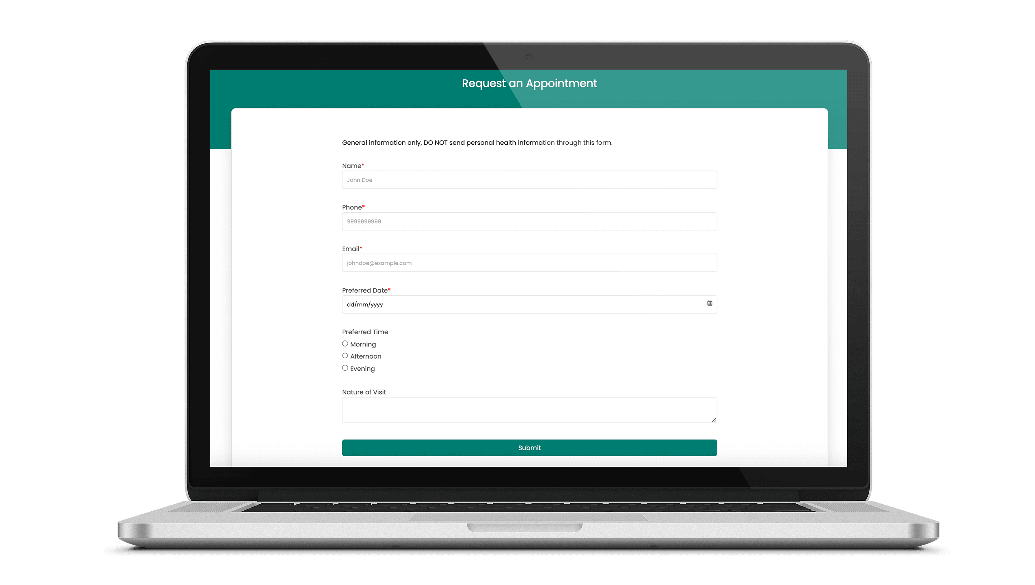
Lastly, we replaced the old PDF forms with online patient intake forms. Patients can now seamlessly schedule appointments from any device. No more manual data entry, making life easier for both patients and the front staff. Practifly’s digital healthcare form builder made form setup quick and hassle-free.
The Final Touch
Ultimately, upon Dr. Malik’s approval, we had the new website up and running!
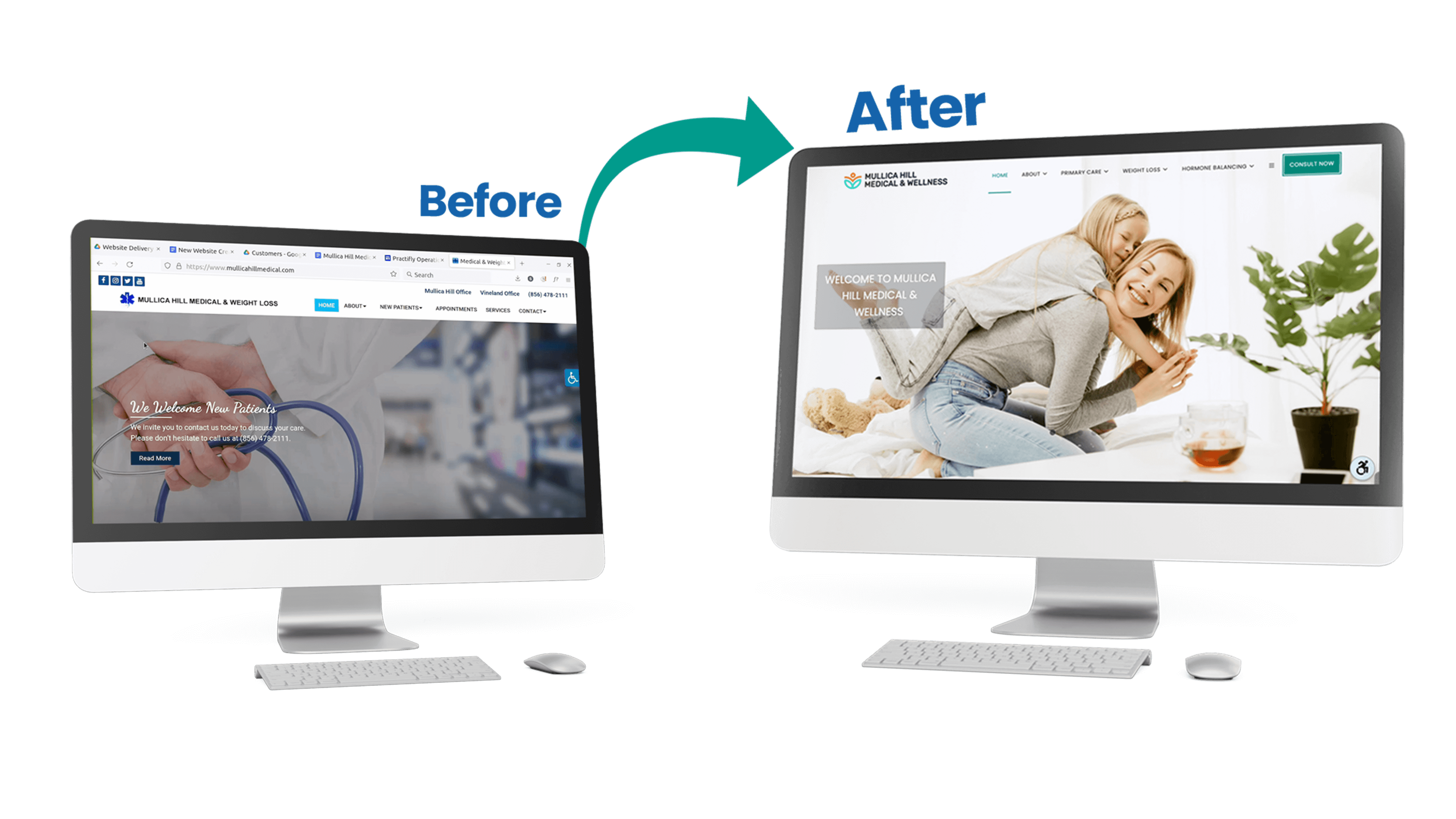
The entire process took 5 weeks, as it’s super easy to create and edit a website in the Practifly CMS.
The best part? Dr. Malik loved the way we involved him at every step of our process, from the website audit and content review to the site design approval and digital form setup.
Results and Improvements
In one year, Practifly helped Mullica Hill Medical & Wellness:
- Bring in 85% new patients online
- Improve their practice’s Google Business Profile (GBP) visibility on mobile devices
- Rank in the top 5 search results on page 1 of Google for 115 search queries
- Attract more people to their website, more than half of whom had never heard of their practice before
Mullica Hill Medical’s partnership with Practifly resulted in a complete transformation of their online presence. Dr. Malik and his team now have a modern, patient-friendly website that reflects the quality of care they provide and supports the continued growth of their practice.
The new website not only enhanced patient experience, but also significantly improved the practice’s visibility and lead generation.
“Their support continues to be very responsive, and we interact directly with their marketing experts.“
– Dr. Rajesh Malik MD